
By Jasmina Susak • Updated on May 21, 2026 • Includes FREE drawing tutorials
In this blog, you’ll learn how to draw portraits with colored pencils step by step.
I’ll show you how I draw realistic faces, create smooth skin tones, and blend everything using simple colored pencil techniques.
The technique I use in this blog and tutorial is just one of many. I’m not saying it’s the best way to draw a realistic face — it’s just the method I figured out on my own.
There are many ways to get the right skin tones. You’ll need to experiment with different techniques and color combinations to see what works for you. Every face is unique, and every skin tone needs a different approach. I often use different pencils or try new mixtures.
Table of contents
- Learn to Draw Realistic Portraits in Colored Pencil
- How to Blend Skin Tones with Colored Pencils (Light and Dark)
- My Color Choices in Portraits – Which Colored Pencils to Use for Skin Tones
- Free Step-by-Step Tutorial: How to Draw Portrait and Skin Tones with Colored Pencils
- Sketcher – Sketch Maker for Artists
- If you Struggle with Sketching – Sketcher Turns Your Images into Sketch Lines
- Step 1: Drawing the Eyes with Colored Pencils
- Step 2: Drawing the Nose and Creating Natural Shadows
- Step 3: Coloring the Forehead and Building Skin Tones
- Step 4: Shading the Left Side of the Face
- Step 5: Shading the Right Side of the Face
- Step 6: Coloring the Lips and Teeth
- Step 7: Drawing the Neck with Smooth Color Transitions
- Step 8: Drawing the Hair with Realistic Pencil Strokes
- Frequently Asked Questions About Drawing Realistic Portraits with Colored Pencils
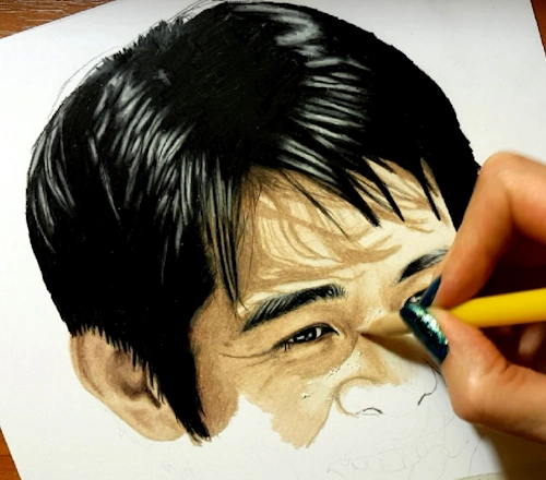
My technique involves heavy blending and burnishing. I like my portraits to look like a photo — as much as possible.

Learn to Draw Realistic Portraits in Colored Pencil
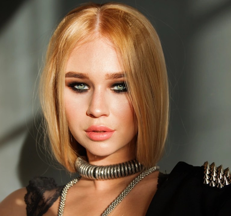
Before you start drawing a portrait, it’s important to choose the right reference photo — one with accurate colors and good lighting.
When you can’t take your own photograph, or you want to draw a celebrity, choose a photo with great highlights and shadows — a photo with a full range of value from light to dark. If you want to draw your friends or family members, pose them so there are some shadow areas on the face, as this will add depth and a third dimension to your portrait. Don’t use the flash, or you’ll lose all the good colors and flatten out the face.
So, the same face can be photographed under different lighting and in different circumstances, and the colors we’ll need will vary from photo to photo. Not to mention, we almost always have to layer different colors over one another to achieve the desired skin tone. Also, it matters which pencil is used first as the base color, which one comes second, third, and so on.
The more colors and subtle nuances we use when we color a face, the more realistic the result will be.
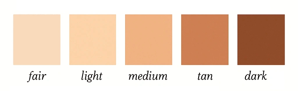
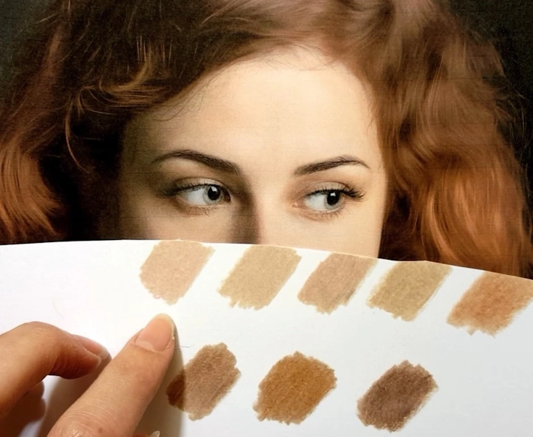
Fortunately, there’s a wide range of skin tones, and as artists, we love working with all of them. It gives us the chance to use so many beautiful colors — how boring it would be if every portrait used the same tones! For simplicity, we often group skin tones into five main categories, which you can see in the swatches below.
I’ve created tutorials on 8 different skin tones for the face, and you can learn how to shade these skin tones step by step as a member of the Colored Pencil Tutor website.
A huge help in deciding which colors to use is the PenPick application, which I’ve explained in detail in my blog post How to Choose the Right Colored Pencils for Your Drawings.
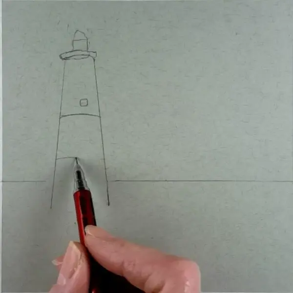
It’s very important to start coloring over a proportional sketch with correct facial ratios because colored pencils can’t be erased. When drawing faces, I usually sketch them using the grid method.
But even if you have a perfect sketch, you can still make the portrait look distorted by applying wrong values. Think about makeup artists and how they change the shape of the nose by applying darker shades.
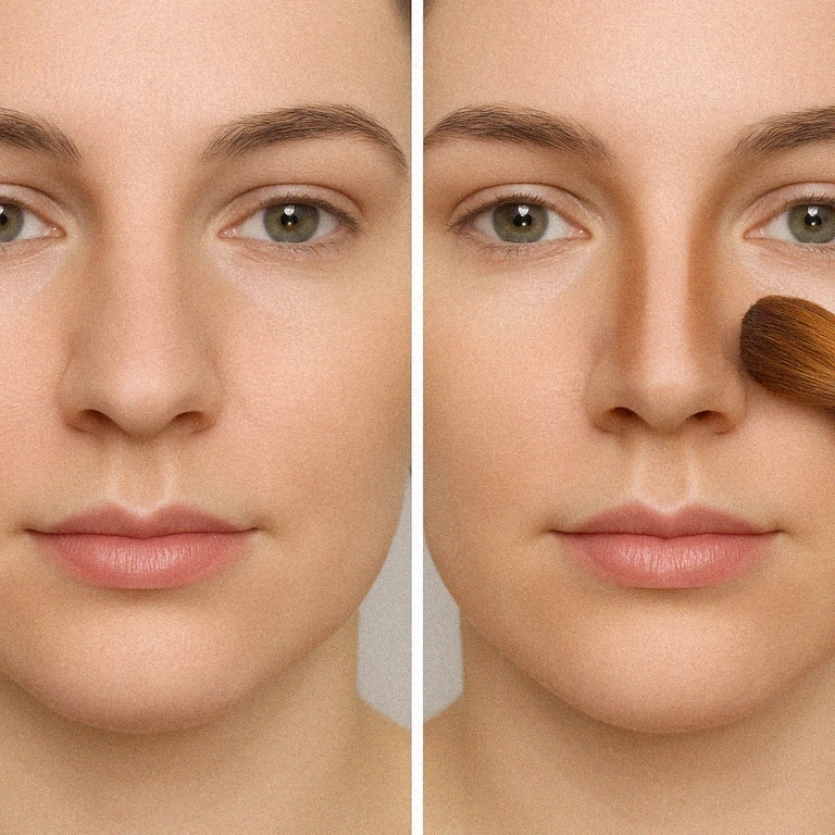
Or how they make the face appear slimmer by adding darker tones under the cheeks.
The same can happen in drawing — you can even make the person look cross-eyed if you place the wrong shade over the eyeball or the skin around it. So, both the sketch and how you color the face are equally important.
How to Blend Skin Tones with Colored Pencils (Light and Dark)
To draw realistic skin, the key is smooth blending and a soft gradient from dark to light. You can create different values with the same pencil by lessening pressure toward the highlights and pressing harder in the shadows. It’s all like shading a sphere, so practicing that first is a must.
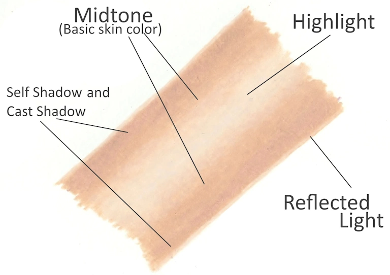
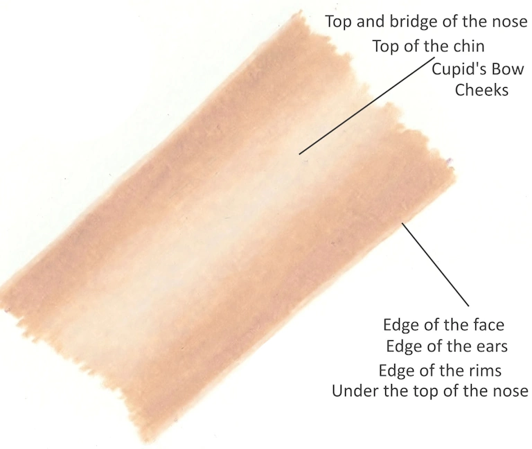
The image below breaks down highlight zones like the nose, cheeks, and chin, where the skin reflects more light. These areas should stay light and softly blended into surrounding tones.
The same technique applies for dark skin, but of course with a different color combination that I talk about in this article. Keep reading…
My Color Choices in Portraits – Which Colored Pencils to Use for Skin Tones
Creating human skin with colored pencils can be one of the most difficult subjects to draw. The skin and its wide variety of tones and colors can present unique challenges for artists, especially when aiming for a realistic look.
I always use a variety of colored pencil combinations to create different skin tones, as you’ll see throughout this chapter. All of the colored pencils used here are from Prismacolor Premier, although I also work with Caran d’Ache Luminance for certain portraits.
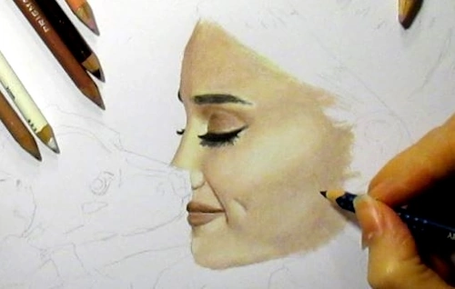
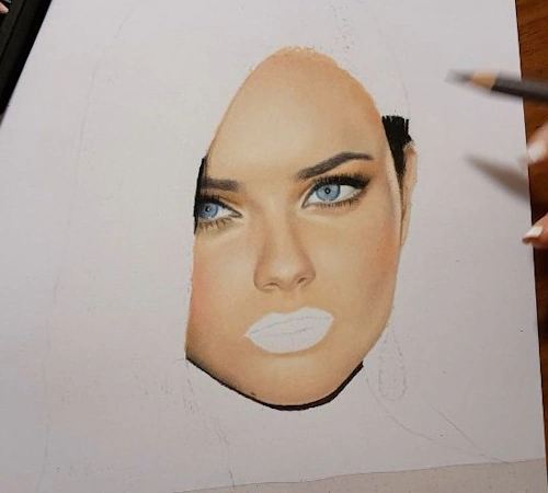
For the portrait of Ariana Grande (next image), I used Rosy Beige (PC 1019) for the skin and added highlights with Cream (PC 914). You might notice that I haven’t used Cream in any of the tutorials here. That’s because each reference is different—another photo of her might need completely different colors.
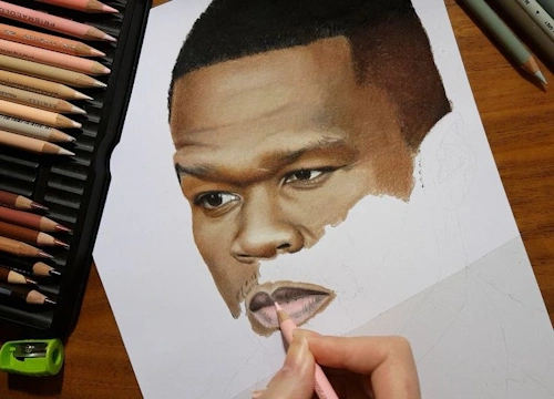
For the portrait of 50 Cent, I used Beige Sienna (PC 1080) as the base skin tone. For highlights, I used Peach Beige (PC 1085) and White (PC 938). Shadows were done with Dark Brown (PC 946), Dark Umber (PC 947), and touches of Warm Greys. For his lower lip, I added a bit of Deco Pink (PC 1014).
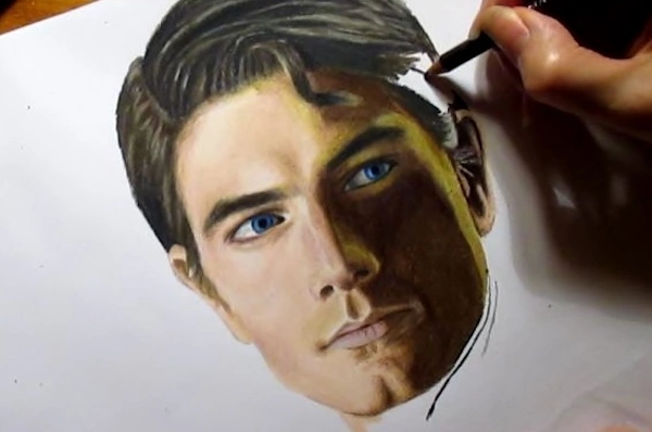
When drawing Henry Cavill as Superman, I worked with Peach Beige (PC 1085) — Ginger Root (PC 1084) also works great — and shaded with Light Umber (PC 941) and Dark Brown (PC 946).
For Adriana Lima, I used Light Peach (PC 927) as the base, with some Deco Peach (PC 1013) and Deco Pink (PC 1014) for warmth and softness in the face.
In the portrait of Brandon Routh as Superman, I applied Light Peach (PC 927) and Peach Beige (PC 1085) on the highlighted side of the face, and Dark Umber (PC 947) for the shadows. There’s also a spot on the right side of the shadowed area where I added Lime Peel (PC 1005) and Canary Yellow (PC 916) — that’s because the light falling there had a yellow-green tint. Don’t be afraid to use unusual colors if you see them in your reference.
For The Arrow, I started with Putty Beige (PC 1083) as the base. His facial hair was done with Light Umber (PC 941) and French Grey 90% (PC 1076). I added a touch of Apple Green (PC 912) to the shaded side of the face because the green hood reflects onto the skin.
In Morgan Freeman’s portrait, I used Chocolate (PC 1082) for the skin and blended it with Peach Beige (PC 1085). His hair was drawn using Cool Greys.
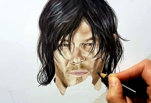
For Norman Reedus as Daryl Dixon, the main skin colors were Light Umber (PC 941) and Putty Beige (PC 1083). I used Warm Greys for the hair and Rosy Beige (PC 1019) for the lips.
In the portrait of Markiplier, I went with Peach (PC 939) and Beige (PC 997) as the base skin tones. Ginger Root (PC 1084) also works well in this drawing.
For the portrait of Robert Downey Jr., I used a combination of Peach Beige (PC 1085) and Light Peach (PC 927). For a different photo of him, I would’ve needed a different combination.
I used Putty Beige (PC 1083) and Light Peach (PC 927) for the skin of Henry Cavill’s Superman.
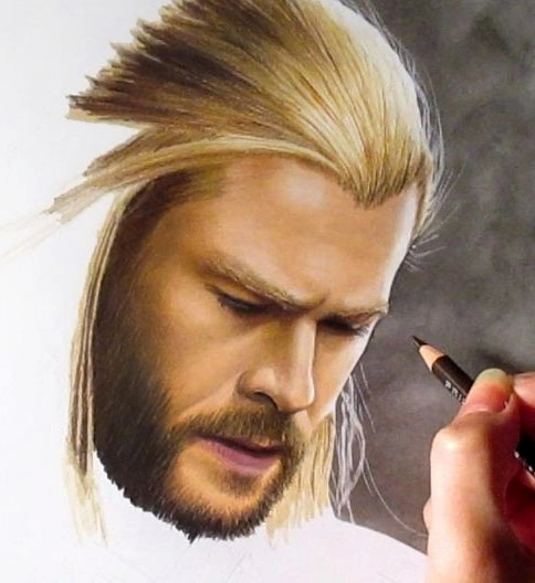
For the skin of Chris Hemsworth as Thor, I used Burnt Ochre 10% (872) by Luminance and Light Umber (PC 941). I had to use some “unusual” colors near his facial hair — that area needed a greenish-brown tone, so I lightly layered Moss Green (PC 1097).
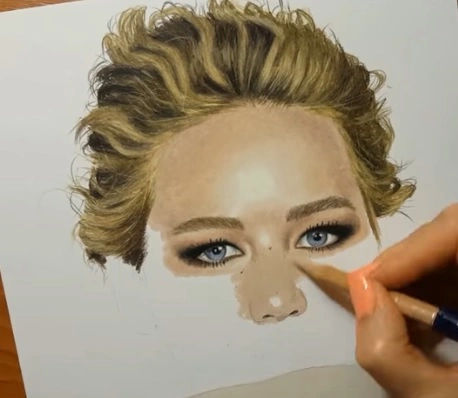
I used a mix of Putty Beige (PC 1083), Light Peach (PC 927), and Seashell Pink (PC 1093) for the portrait of Jennifer Lawrence.
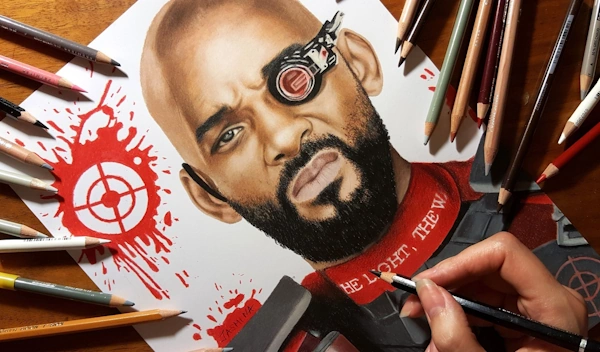
Beige Sienna (PC 1080) was the base color for the skin of Will Smith as Deadshot. I blended it with Peach Beige (PC 1085) and white and used Dark Brown (PC 946) for the shadows.
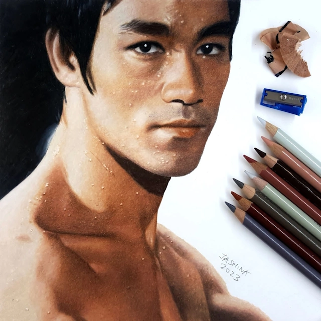
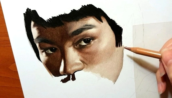
For Bruce Lee, I used Putty Beige (PC 1083) and Light Umber (PC 941) for the skin, and Dark Brown for the shadows — applied directly, without a base layer.
In another portrait of Will Smith, I used a combination of Light Umber (PC 941) and Beige Sienna (PC 1080).
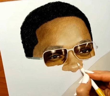
For the drawing of Jet Li, Peach Beige (PC 1085) was the main pencil. I blended the highlights with white and created the shadows using Light Umber (PC 941).
As you can see, there are so many ways to color a face and build different skin tones. The more colored pencils you own, the more combinations you can try. I hope you’re able to invest in good materials and have the time to draw often. With patience, experience, and practice, you’ll get better and better at creating realistic faces.
Not sure which colored pencil brand to buy? Check out my blog Top 3 Best Colored Pencils for Artists in 2025 — based on real experience.
Watch the time-lapse video below to see how I drew a dark-skinned girl on Strathmore Toned Gray paper, using mostly Caran d’Ache Luminance colored pencils and the grid-method for sketching.
If you’d like to watch the full narrated video in real time, subscribe to the Colored Pencil Tutor website, where I post new portrait drawings every week — along with over 600+ hours of real-time tutorials, plus written guides with step-by-step images.
Drawing Tutorials on Colored Pencil Tutor
600+ Hours of Drawing Videos • Photorealism Lessons • Hand-Drawn Art • Step-by-Step Tutorials

Free Step-by-Step Tutorial: How to Draw Portrait and Skin Tones with Colored Pencils
If you’re looking for a beginner-friendly portrait drawing technique, this method is great for getting realistic results without overcomplicating the process.
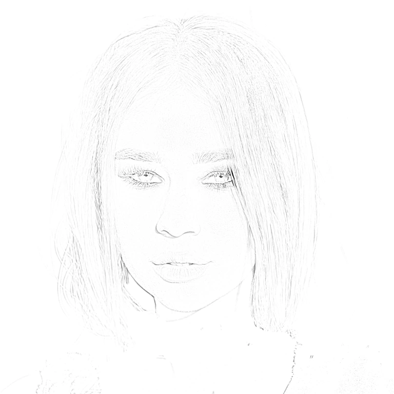
Now let me explain how I drew a realistic portrait of this girl. The reference photo I used is in the public domain, and I found it on Pixabay.
First, I created the proportional sketch in Sketcher – Sketch Maker for Artists
Sketcher – Sketch Maker for Artists
If you Struggle with Sketching – Sketcher Turns Your Images into Sketch Lines
Interactive Tool for Artists, Hobbyists, and Professionals
Sketcher is a web application with interactive controls that converts reference photos into clean pencil-style sketch lines on white, gray, black paper, or as a transparent PNG. Sketcher creates precise outlines you can print, project, trace, engrave, stitch, or color, without guessing proportions or struggling with tracing.
With Sketcher you get:
- Extracted edges from photos
- Clean outlines instead of grid guessing
- Transparent PNG for printing or projection
- Handles high-resolution images (6000px+)
- Downloadable, printable outlines
- Privacy first: runs entirely in your browser
Try the interactive Sketcher demo at www.sketch-draw.com

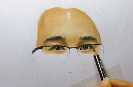
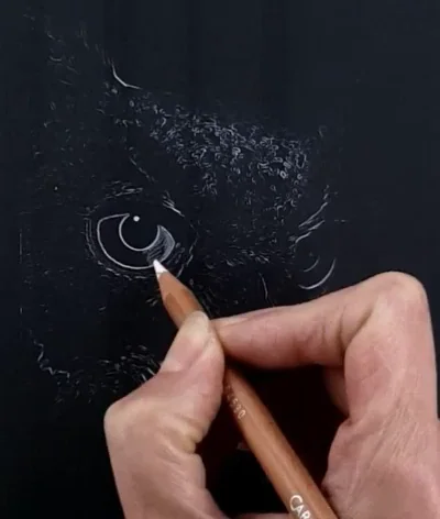
Step 1: Drawing the Eyes with Colored Pencils
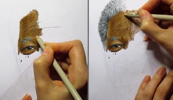
For the eyes, I used Celadon Green, Sap Green Light, Rosy Beige, and Cool Greys, all from Prismacolor Premier colored pencils.
Around the eyes and for the eyebrows, I used Black, Dark Umber, Dark Brown, and Sienna Brown, also from Prismacolor Premier.
If you want to watch the narrated real-time videos, join the Colored Pencil Tutor website subscription. You’ll get access to many more videos on how to draw portraits with colored pencils only.
I’ve also provided plenty of written step-by-step tutorials with pictures and downloadable PDF files to help you learn and follow along.
Step 2: Drawing the Nose and Creating Natural Shadows
Now, the next very important step is figuring out which colored pencils to use for the skin. I uploaded the reference photo into the PenPick Colored Pencils web application and clicked on different areas of the face — over the highlights, midtone areas, and shadows.
I used PenPick to help me with color selection. You can join us and use it with your own reference photo, anytime, 24/7, in any browser.
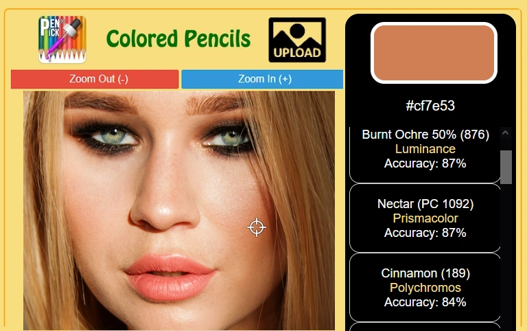
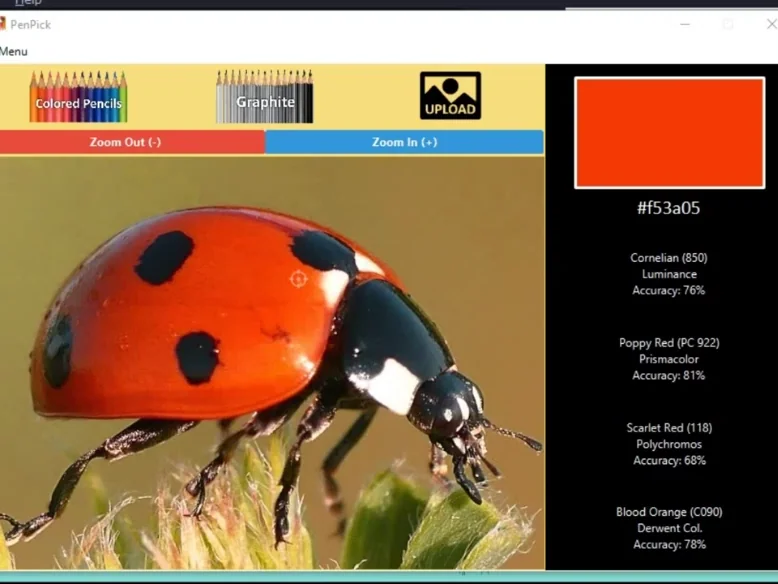
When you upload a reference photo and select an area from your reference photo, PenPick suggests which colored pencil to use – see demonstration on a ladybug drawing. The application features 28 most popular colored pencil brands.
Since I use wax-based colored pencils for my drawings, like Prismacolor Premier and Caran d’Ache Luminance, here are the recommendations I got:
- Light Peach by Prismacolor Premier for the midtones, along with Peach and Nectar
- Sienna Brown and Dark Brown for the shadowed areas, also from Prismacolor Premier
- Additionally, I used Burnt Ochre 10% and 50% by Caran d’Ache Luminance
I started coloring the skin with the nose, applying Light Peach as the base color and leaving the middle area untouched for the highlights. For the shadowed parts, I added Sienna Brown and Dark Brown and blended the transition between these areas using Peach and Nectar.
Watch the real-time drawing video below (it’s not narrated). You’ll learn the most by watching the process and trying to do the same.
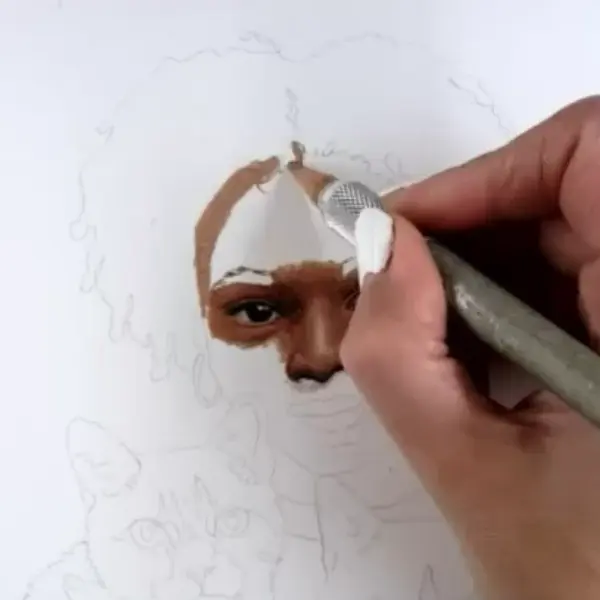
Step 3: Coloring the Forehead and Building Skin Tones
Then I moved to the forehead and colored the entire area with Light Peach colored pencil. After that, I applied Nectar over everything except for the highlighted part in the center. When you color a face, it’s important to give the head a rounded shape by building up shadows, midtones, and highlights. This step is essential for creating realistic skin tones and adding depth to your portrait drawing.
This is how I approach shading skin with colored pencils to build soft transitions between highlights, midtones, and shadows.
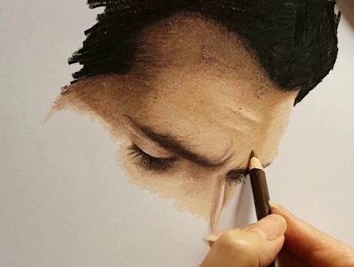
Step 4: Shading the Left Side of the Face
I continued with the left side of the face, applying Light Peach first, then layering Nectar — but only near the edge of the face. The area next to the nose and the cheek should stay light to keep that natural glow. The lower part of the jaw is usually darker, especially in cases like this where longer hair casts a shadow over the face. So here, I used Sienna Brown by Prismacolor Premier and Burnt Ochre 50% by Caran d’Ache Luminance. To outline the jaw and neck, I used Dark Umber because this area is heavily shadowed and doesn’t get any light. So, use the darkest brown you have — don’t be afraid to go bold.
It’s always important to create a smooth gradient transition between highlights, midtone, and shadowed areas when you’re trying to draw realistic faces and natural-looking skin tones. See how helpful it is to learn to shade a sphere first and practice your gradients?
Step 5: Shading the Right Side of the Face
The right side of the face should be colored using the same colored pencils, since the light source is coming from the front and both sides are equally illuminated. So, use the same pencils from the previous step, and apply the same method for creating darker shades at the bottom of the jaw and in the areas where the hair casts a shadow over the skin using Dark Brown and Dark Umber by Prismacolor Premier.
The chin should stay highlighted in the middle, so use only Light Peach there, and then lightly color around it with Nectar. As you move away from the highlights, introduce Burnt Ochre 50% by Caran d’Ache Luminance to deepen the shadows and add more dimension to the face.
I have lots of real-time drawing videos of portraits at the Colored Pencil Tutor website.
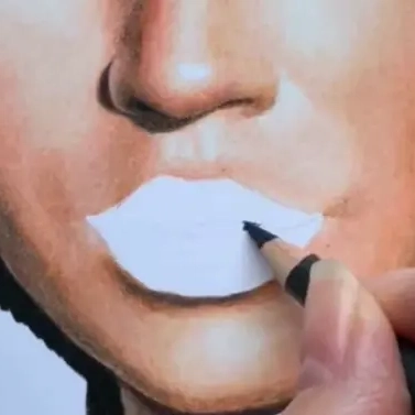
Step 6: Coloring the Lips and Teeth
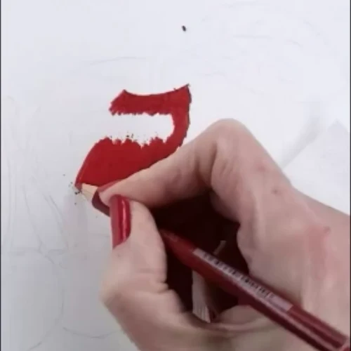
Now that we’ve colored the skin around the lips, it’s time to color the lips too. As a base color, I used Salmon Pink by Prismacolor Premier. For the teeth, I applied Cool Greys to create soft shadows. I added a second layer to the lips using Poppy Red, then created highlights with White and shadows with Dark Brown — all from Prismacolor Premier.
Step 7: Drawing the Neck with Smooth Color Transitions
For the neck, I applied Light Peach on the highlighted side (left). The area next to the hair on the right side of the neck gets less light, so I used Dark Brown by Prismacolor Premier right near the edge. Over it, I applied Burnt Ochre by Luminance, then Burnt Ochre 50%, and finally Burnt Ochre 10%. These are basically the same color in different values, so it’s really easy to create smooth gradients. That’s why I love when they manufacture colored pencils this way. For example, the Cool Gray set by Prismacolor includes 10%, 20%, 30%, 50%, 70%, and 90% — which is amazing. Though I do wish they added 40%, 60%, and 80% too! 🙂
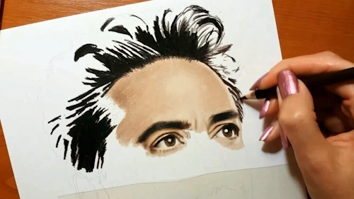
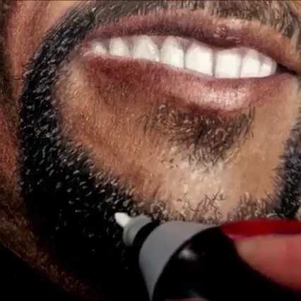
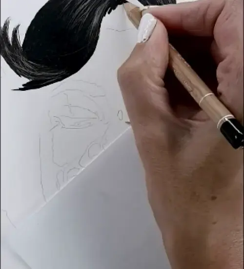
Step 8: Drawing the Hair with Realistic Pencil Strokes
When it comes to drawing hair, many beginners find it challenging because it takes a lot of time — sometimes almost as much as drawing the entire face. That’s because we have to draw it strand by strand, and that requires patience.
For this portrait, I started with Dark Umber and Dark Brown colored pencils by Prismacolor Premier. I began each stroke from both ends of the hair length and drew toward the highlighted area. As I got closer to the highlight, I released pressure on the pencil and gently lifted the tip. This made the strokes gradually fade into the whiteness of the paper.
As you can see in the image below, even with just a few main strands drawn to set the direction and shape of the hair and head, this technique already creates a shiny, realistic effect.
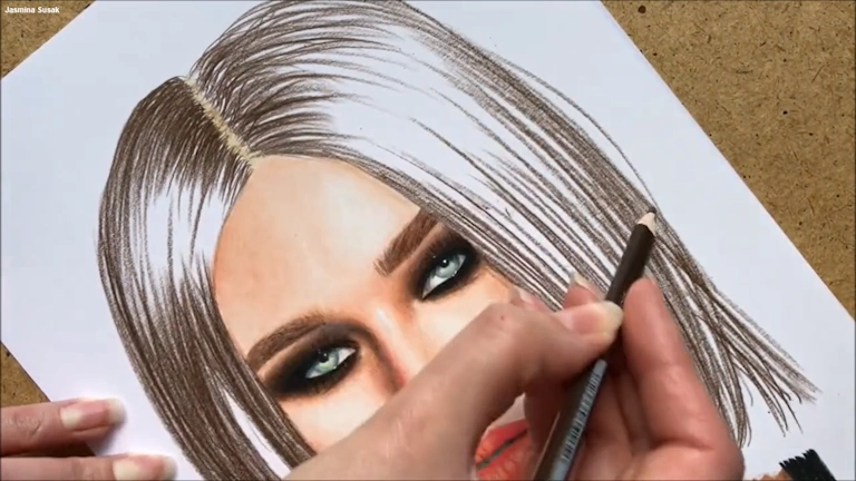
The next thing I did was cover the entire hair area, including the highlights, with Peach Beige. This way, I colored the highlights as well — since they shouldn’t stay completely white — and at the same time, I blended the pencil strokes I created in the previous step. To create a realistic portrait, we have to use many different colors — otherwise, the face and the entire drawing can look flat. The same applies to hair: the more colors we use, the more realistic and lifelike it will appear.
That’s why I added a layer of Sienna Brown and Terra Cotta, both by Prismacolor Premier. I didn’t cover the entire hair area — instead, I created strokes here and there to give the hair a multi-colored, more natural look. I wanted the drawn hair to be a little darker, so I adjusted the colors. We can always play with color choices and change things — they don’t have to match the reference photo exactly in color or shape.
Below is the real-time video of the whole process of drawing the hair. If you have any questions about this tutorial, the pencils, or the techniques I used, feel free to leave a comment at the bottom of the page. I’ll be glad to answer.
Of course, we can go into much more detail, but this demonstration is meant to keep things simple and easy for the very beginners who are just learning how to draw hair.
Free Online Tools for Artists and Teachers on FreeToolio
No Registration • No AI • No Restrictions • 100% Private • Interactive


Frequently Asked Questions About Drawing Realistic Portraits with Colored Pencils
To create smooth skin texture in my colored pencil portraits, I apply the base color with heavy pressure — not light layers. This burnishing technique fills the tooth of the paper and avoids a grainy look. I blend highlights using White, Light Peach, or similar light colors, then add shadows with darker tones like Sienna Brown or Dark Umber. I often go back over everything with the base color to smooth transitions and get that photo-like finish. My method uses fewer layers and more pressure for strong color blending and a realistic result. It takes a bit of hand strength, so it’s not ideal for kids, but perfect if you’re comfortable pressing firmly with your pencils.
I often get asked what I use to blend colored pencils, and the answer is simple: I blend with another colored pencil. While many artists use solvents or underpaint with other mediums like markers or pastels, I rely entirely on colored pencils only
The secret is layering, color selection, and patience. I always start with a proportional sketch, then slowly build up skin tones using multiple layers of color. My method involves heavy blending and careful attention to light and shadows, which helps the portrait look like a photograph. The right pencils and technique make all the difference.
I use tools like PenPick to help select the right color combinations based on a reference photo. I have written a lot about this topic in another blog How to Choose the Right Colored Pencils for Your Drawings
I mainly use Prismacolor Premier and Caran d’Ache Luminance because they’re wax-based, easy to blend, and offer a wide range of natural skin tones for realistic portraits. But many professional artists achieve wonderful results with oil-based Polychromos by Faber-Castell, especially through careful layering and blending. I also own a set of Polychromos, which I’ve written about in this blog post: Top 3 Best Colored Pencils for Artists in 2025, but I rarely use them in my own work.
Yes, paper matters a lot. I prefer smooth, hot-pressed paper like Fabriano Bristol. Bristol paper, Bristol pads, or even some watercolor (aquarelle) papers can handle heavy pressure without tearing or warping. In contrast, common printer paper is not suitable for the technique I use, which involves strong pressure and burnishing.
The right surface makes a big difference, especially when it comes to blending and layering, which is especially helpful for beginners learning to draw realistic portraits.
The best colored pencils for portraits are the ones that blend well and offer a good range of natural skin tones.
If you liked this article, please rate it below, share it with others, and subscribe for free to the newsletter at the bottom of the site to stay updated on new blog posts.
Leave a comment below to share your drawing journey, ask a question, upload your images, or suggest a topic you’d like me to write about.
Awesome, extraordinary talent